CI Meaning
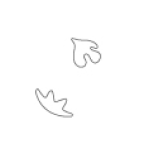
The pigeons and sprouts, the former symbols of Shinhan Financial Group, were reinterpreted to meet the future sensibility of the 21st century and expressed as hopes for future blooming. The “circle” that forms the outer shape is a global symbol for globalization, and the shape S in the middle is a symbol for an indicator of a financial company that runs toward endless growth.
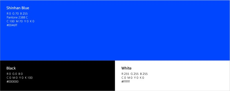
In color application, the blue color representing refined and confident trust and scale, and upgraded gold color representing development and passion have been used to express our vision and confidence as a global financial company that challenges the world.
As for the logo type, it is expressed in Korean and English in a serif style that is familiar with and feels luxurious so that it can be differentiated compared with those of other companies, but still has the upper hand in the image. It also intends to implement innovative will and leap forward into the better future for an established financial company by applying effective and differentiated color systems in expected environmental applications such as autographs, bankbooks, and cards, etc.
CI Symbol
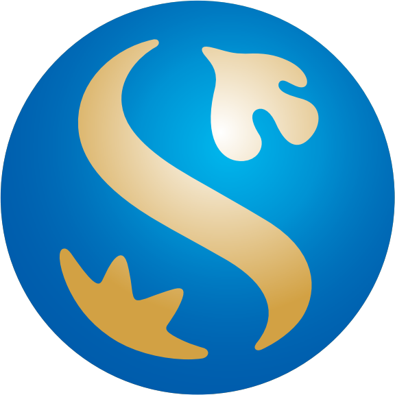

Global / Sense of Scale, Professionalism, Representativeness
Leap into the global comprehensive financial brand representing Korea in the era of globalization
Hope
Reinterpreting the existing key elements, pigeons and sprouts, to meet the future sensibility of the 21st century
Symbol for hope toward bright future

Future Path
Symbolizes Shinhan’s English initial “S” and represents the future path running toward endless growth
Logo type


Color System

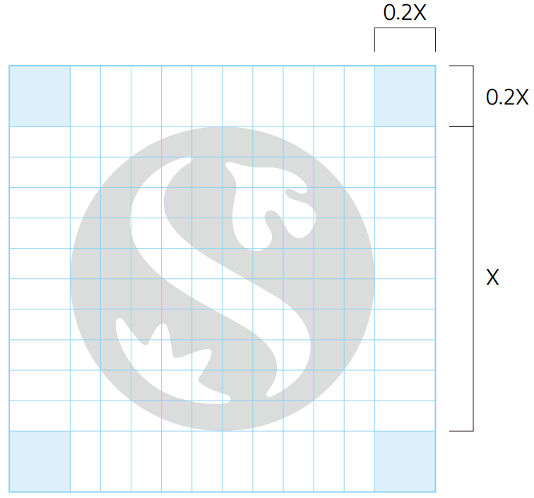
Signature